Frank Bowling in his studio in London, Feburary 2019, photographed for Tate Etc. by Mathilde Agius
Photo © Mathilde Agius
I had Frank Bowling (b.1934) in mind when I came up with an almost monochrome painting in my last year at the Byam Shaw art school, where he was my tutor. When I first worked on the picture it was of a naked woman in a sort of pop art flat space, which, after a few weeks, wouldn’t stop looking awkward. In an attempt to revise it, I painted over much of it with white, quickly washing and knifing on the paint, thinking I was about to redo the nude. But then I noticed a lot of elegant balances. It was a white abstract now. I didn’t know what I’d done, but I thought: Well, this could be a painting if I think of some of the things Frank has said in tutorials.
The task of a tutor in those days was to pay occasional visits to students in their individual cubicles in the art school and improvise some helpful brief analysis. Once, we decided to do the tutorial in an exhibition instead, a survey of post-war British art at the Royal Academy that included one of Frank’s paintings. After pints of Guinness for lunch we got the number 14 bus from Fulham Broadway to Piccadilly and, once in the show, he talked about qualities of surface, mark-making and pictorial organisation in paintings by figures who seemed awfully unglamorous to me. And, conversely, the ones I thought were great and wanted to emulate, he analysed with a cool objectivity. I was interested in a painting in the display by R.B. Kitaj, showing David Hockney as Superman. Frank pointed out the way free-flowing paint was manipulated to create a particular border between a space and an object: the contour of Superman’s knee.
One painting was by the Royal Academician, Robert Buhler, who had taught Frank at the Royal College of Art. When I saw it again recently in a photograph online, the first time I’d seen it since that afternoon at the Academy 40 years before, I found it to be incredibly subtle – a representation of trees and chickens, half its entire surface is loping, loose, horizontal washy strokes, practically abstract. Frank had pointed out the picture’s sophistication, but I’d inwardly rolled my eyes, thinking it must be the work of a loser because it was merely a little yellow ochre landscape.
I recount this discussion about work by artists other than Frank, because he imparted to me an important lesson that took a while to absorb: that a painting has a format or a layout for a reason. It’s what you see first and it’s what causes the work to have, or fail to have, visual strength. I think of him when I think about composition and the overall logic and readability of a painting, whether abstract or figurative. You can overlook it because you’re not mentally prepared, or you can open up to it.

Frank Bowling with his painting Mirror 1964–6 at Lupus Street, London, c.1964
Courtesy Frank Bowling Archive

Frank Bowling, Mirror 1964–6, oil paint on canvas, 310 x 216.8 cm
© Frank Bowling. All Rights Reserved, DACS 2019, photo: Tate Photography
At the exhibition we had looked at his painting Mirror 1964–6, completed when he was 30, five years before he was awarded a solo show at the Whitney Museum in New York. On the way out of the show, he was dismayed not to find any publicity material in the lobby about his own career, where there was plenty relating to the other artists represented. His feelings were hurt, and I thought of the advice he often gave about toughness, both visual (how paintings work) and emotional (how a painter copes with worldliness). You had to make your work but also a career, treading these parallel paths with care.
I soon became aware of the role adversity had played throughout practically the whole of his 60-year (so far) career, purely because of his skin colour. But I was also impressed by his particular morality. He is true to himself when he paints, but he doesn’t convey egotism: he is thoughtful. He works by spontaneous improvisation but never makes a painting that is only a spectacle or a provocation. He thinks about painterly structures every moment of the day. He actually wakes up thinking about them.
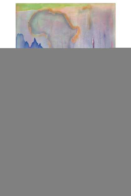
If I think of a painting like Towards Crab Island 1983 I see the work of a painters’ painter. The concept of a painters’ painter is that some painters are appreciated by other painters because they, in particular, expose painterly operations: they make the medium into a subject. The wider public is quite understandably not so interested in technique, and more used to looking for what the technique is in aid of: the meaning or the story. Frank pushes meanings and stories away, essentially, but brings them back in, as hints, in his titles. Crab Island is known to him from his Guyanese background. He didn’t set out to paint it, but it seemed vividly there once the painting was done.

Frank Bowling, Towards Crab Island 1983, acrylic paint, acrylic gel, acrylic foam and other materials on canvas, 175.3 x 289.6 cm
© Frank Bowling. All Rights Reserved, DACS 2019
The painting was done in the year I lent him Heart of Darkness, having just read it. We were each equally awed by the amazing scene Joseph Conrad describes of a man-of-war anchored off the coast of the Belgian Congo, firing cannon shot into the bush every day, just out of random colonialist sadism. Why do I remember this? Conrad’s book epitomising colonialism as horror obviously has a loaded meaning for an artist who has experienced racism as Frank has. On the other hand, he often feels suffocated by his background, dismayed that the art world might think only about his skin-tone. He says Guyana for him sometimes feels like the heavy rock Sisyphus is doomed to be forever rolling up a hill.
Contradictory as it might sound, I think that much of his painting sensibility is very English. He might rightly be considered international or Caribbean or global, or even a New York artist; he is all these. But it was in an English context that he was first formed artistically. He went to London art schools and the first serious art he saw was in London’s National Gallery. When we think we see abstract expressionism in his paintings because they are large-scale, brightly coloured and mostly free of representation, we’re really seeing two traditions. These are the broad, stark improvisations and inventions of Barnett Newman and Mark Rothko; and the depths and transparencies – subtle mists and vagueness riding on submerged geometric structures – of the English landscape tradition, from Gainsborough to Turner.

Frank Bowling, Raining Down South 1968, acrylic paint and spray paint on canvas, 348.5 x 275.5 cm
© Frank Bowling. All Rights Reserved, DACS 2019, courtesy Hales Gallery, London

Frank Bowling in his studio at 535 Broadway in New York
Courtesy Frank Bowling Archive
He paints from a spirit of pleasure alongside one of enquiry, and gives both a context of toughness. He takes wild risks and fights his own abilities, so when he gets to a visual balance within a painting there is a surprise. Towards Crab Island has life’s unexpected dynamism even though nothing is actually pictured. We see movements and atmospheres. Terrains. Gushes of energy. We enjoy light-filled pouring torrents, strange barriers and boundaries; strange because the whole point was to make something surprising, non-planned, using bizarre methods. Pouring; sticking things in; following the movement of the material that might be liquefied, thick, viscous, trickling or heaving.
Regardless of picturing things or not picturing, Towards Crab Island expresses what life has been like for its author. It suggests islands and water and mists, but it is also simply colour organised in a visual system that answers only to itself. He arrives unexpectedly at the visual equivalent of a novel or even a political tract through the richness of a treated canvas surface.

Frank Bowling, Tony's Anvil 1975, acrylic paint on canvas, 173 x 107 cm
© Frank Bowling. All Rights Reserved, DACS 2019

Frank Bowling, Iona Miriam's Christmas Visit To & From Brighton 2014, acrylic paint and plastic objects on canvas, 189 x 122.5 cm
© Frank Bowling. All Rights Reserved, DACS 2019, courtesy Hales Gallery, London
Frank Bowling, Tate Britain, 31 May – 26 August, curated by Elena Crippa, Curator, Modern and Contemporary British Art, Tate Britain with Laura Castagnini, Assistant Curator, Modern and Contemporary British Art, Tate Britain. Supported by AGC Equity Partners, with additional support from the Frank Bowling Exhibition Supporters Circle, Tate Americas Foundation, Tate International Council, Tate Patrons and Tate Members.
Matthew Collings is an art critic, artist, writer and broadcaster. He is currently writing a book on contemporary painting for Thames & Hudson.