‘I get to clarity through a juggling and balancing of disparate elements.’
Alan Uglow, 1989.1
There is a wonderful story of the British painter Alan Uglow (1941–2011) cutting a hole in the chain-link fence around the sports field at New York’s Pratt University in the mid-1970s.2 His accomplice was the German artist Blinky Palermo and they both wanted to play football. The story resonates as a picture of two European artists in voluntary exile in New York finding friendship in happy transgression, but it also illustrates a slight pang for the European cultures they had left behind. For both of these artists, America was a foreign country.3 Of the two, Palermo’s career has been the more studied, especially in recent years.4 Uglow’s, however, is a parallel and equally fascinating story.
Uglow was a singular figure who valued resistance and independence in his work. He moved from London to New York in 1969 and there developed a unique painting practice. But Uglow’s work can also be seen to draw heavily on his formative years in Britain – to the London of the late 1960s and to the particular set of debates and interpretations that were then prevalent in the city. Uglow’s subsequent paintings were informed in part by his experience of the reception of the New York school painting in Britain during this period. This reception involved an element of misrepresentation, where the graphic and formal character of these large abstract expressionist and colour field paintings were prioritised over their material and conceptual qualities. This graphic reading enabled a coming together of opposing artistic languages – a diagrammatic form of popular design and the language of modernist abstraction. This coalescence, which has been suggested by critic and curator Éric de Chassey to be a specifically British sensibility, I see as important in the formation of Uglow’s practice.5

Fig.1
Alan Uglow
Standard # 8 (Blue) 1994
© The estate of Alan Uglow
Uglow can be seen to have blended these languages together in his series of Standard paintings (1992–2009) (fig.1) and other works that are informed by both a modernist tradition in abstract painting and a provocative and nuanced association with the depiction of the linear marking on football and sports pitches. I see this trait as connecting Uglow’s ideas to those of the British artist Bob Law, especially through both artists use of open fields, and informing the initial development, in London in 1968, of Uglow’s first ‘lowrider’ canvas. Indeed, even the unconventional hanging systems that Uglow explored in the ‘lowrider’ works and others can be seen to connect to developments he witnessed in London during his time in the city. I see Uglow’s negotiation with these ideas as giving him license, in a very specific New York context, to reinvigorate the minimalist and post-minimalist painting tradition he explored in that city. The canvases, installations and reprographic artworks Uglow produced from the late 1960s until his death in 2011 can be seen to have opened up new ground for painting, complicating and enriching ideas associated with post minimalist practice. Perhaps this is one of the reasons that his work is to my mind so original.
My account of Uglow’s formation was built through a number of conversations I had in person and by email between 2015 and 2018 with Uglow’s wife Elena Alexander and his friend the artist Emrys Parry, as well as other artists, gallerists and critics. I conducted additional archival research at the Uglow archive in New York which holds the artist’s files and all the published articles, reviews and essays on Uglow, as well as a number of unpublished texts. In London I consulted the Central School of Arts archive at Central Saint Martins in London and the Tate Archive. I also examined Uglow’s works in London and New York.
Formative years in Britain
Born in Luton in 1941, Alan Uglow attended Colchester Art School at fourteen, and then at seventeen enrolled at Leicester College of Art, where he studied from 1958–1962, when his parents moved back to Peterborough. He continued his studies in London at Central School of Arts and Crafts (1962–1964) before setting up a studio in Bassett Road in West London. He taught part-time in British art colleges before visiting and then permanently moving to New York in 1969.
However, within his published interviews he rarely spoke in depth about his time in Britain.6 His silence is interesting, showing if not a desire for erasure, then a certain wish to escape from what he perhaps saw as the provincialism of 1960s England. When he does speak about his student days, he talks of the turgidity and greyness of British kitchen sink realist painting and the tediousness of constant observational drawing, broken sporadically by a few rays of excitement.7

Fig.2
Tom Hudson teaching in the 1960s
© Basic Design Council
One ray was undoubtedly his time in contact with the Foundation course at Leicester College of Art. As a teenager, Uglow found himself in one of the country’s most progressive art schools at a transformational moment in British art education. He was, however, on the wrong course. He had enrolled on the older, more prescriptive National Diploma in Design and experienced first-hand the clash of systems, as the curriculum of his course, which he described as focused on ‘conforming to [a] mundane standard of representational painting’ came into contact with the newer, more dynamic Foundation course which was set up for the following year’s intake.8 The Foundation course was where the young Uglow gravitated. It was led by the artist Tom Hudson (fig.2) and taught by what Uglow described as ‘a wild bunch of artists who were used to dissidence and self-awareness’.9 Uglow would seek out Hudson’s young teaching team who had come to Leicester en masse from Leeds College of Art. That forward-thinking group of teacher-artists included Brian Fielding, Victor Newsome, Terry Setch, and Michael Sandle. Under Hudson’s leadership they developed a pedagogy that valued an experimental exploration of materials while promoting the relationship between art and technological progress.
The inspiration was the Bauhaus, the German art and design school founded by Walter Gropius in Weimar in 1919. Of particular interest for Hudson and his staff was its preliminary course, where all students studied a variety of materials and design concepts before progressing on to specific workshops. The course had recently been championed in Britain at the 1956 Bretton Hall Art Education Conference and led to the development of the ‘Basic Design’ educational movement in Britain.10 It was through this conference and others like it, as much as through the later Coldstream Report, that artists like Hudson dramatically changed art education in Britain and moved it away from the prescriptive, academic style of teaching that was then the norm.11 The Bretton Hall conference and the new Basic Design courses and summer schools that sprung up in its wake offered something different – a pedagogy that was progressive, modernist and sought to integrate art more closely with life in the new post-war age. This educational turn, from its roots at the Bauhaus was informed by new ideas in child development, such as those of Friedrich Fröbel (1782–1852) and Rudolf Steiner (1861–1925), that stressed the importance of freedom of expression.12 Students were asked to explore, play and re-imagine basic design elements and vocabularies, and to analyse conceptually how visual images were created. The Basic Design movement developed first in colleges in the Midlands, as well as Leeds, Leicester, Sheffield and perhaps most famously in the north at Newcastle, where Basic Design was led by Victor Pasmore alongside a young Richard Hamilton.
While at Leicester, Uglow really responded to the way Hudson pushed his students to break from the past – to fully embrace the new and to be present, active and questioning. These were all traits that Uglow’s work and life would exemplify. As a young student of seventeen years he already identified himself as a painter. Together with one or two friends, Uglow hung out with Hudson’s young faculty, working alongside them in the print and painting studios and debating art in Leicester’s pubs and bars.13 Uglow thrived off the passion and dedication of this young team and their shared love of European modernism and knowledge of new North American culture. At the time US jazz and movies were all vitally important, as, of course, was the emergence of abstract expressionism and the New York school painters that were just then becoming visible through invigorated press coverage. Uglow, who was eager, active and had always made himself well informed, consequently took the pilgrimage from Leicester, hitchhiking with his art student friend Emrys Parry, to the Tate Gallery in London to see the New American Painting exhibition in 1959.14 This was the first major display focused on New York school painting and abstract expressionism for a British public. The exhibition showed the work of seventeen artists, with paintings by Jackson Pollock, Phillip Guston, Willem de Kooning, Robert Motherwell, as well as artists that Uglow would later cite as being particularly important to him such as Franz Kline, Barnett Newman and Mark Rothko. The exhibition had a profound effect on Uglow and is mentioned by a whole generation of British painters such as Bridget Riley, John Hoyland, and Robyn Denny, as a turning point in their nascent careers. Uglow was later to say that he was so deeply affected by the exhibition not because he understood everything he was seeing – he has stated that he ‘didn’t really get it’ at the time – but because he ‘was sure they [the American painters] would understand everything I was trying to do’.15
From Leicester Uglow moved to London, and the Central School of Arts and Crafts where he studied for two more years for his degree in Painting and Printmaking, graduating in 1962 at the age of twenty-one.16 The faculty of the school, led by the artist Morris Kestelman, was well respected but not as dynamic as Leicester. In London, Uglow was taught by a roster of twenty or so painters and draughtsmen including Mervyn Peake, Cecil Collins and Alan Reynolds, the so-called ‘golden boy of neo-romanticism’ who had dramatically jumped ship to the constructivist cause.17 Reynolds’s conversion neatly illustrates what seemed like the only debate then challenging the British art establishment’s view of painting – the chasm between figuration and abstraction.18 This dispute was far more conventional than the debates Uglow experienced in Leicester, where Hudson’s radical approach instilled a greater understanding of the complex connections between artforms and their sociological and geographical groundings.
During his time at Central, Uglow’s paintings were inspired by abstract expressionism’s scale and gesture, and were critically successful. He was selected for the 1960 Young Contemporaries exhibition at the Whitechapel Art Gallery, and four years later for the 1964 iteration of the same exhibition at the Federation of British Artists. There he exhibited brighter, more intensely-colourful abstract paintings, on custom-built stretchers with rounded corners, in colours like ‘acid greens and brilliant oranges’, that were ‘kind of stripey and spotty.’19 This was all a considerable achievement for a young artist at the time. The 1960 Young Contemporaries exhibition is the moment when the young artists associated with British pop art can be seen to have emerged and challenged the status quo.20 Although Uglow did not embrace pop at the time, his subsequent interest in basing artworks on football’s visual culture, or the colours of motor cars, as well as his detached aesthetic all link with aspects of the nascent movement. At the time, the movement saw pop not just within what we would now call pop art, but through the lens of a whole new Mod culture, inspired as much by imported US modernist-jazz and the bold and colourful graphic quality of Blue Note record design, which Uglow was interested in, as it was by British Vaudeville traditions.21

Fig.3
‘West London 1958-68: The Avant-Garde and their locations’
Published in David Mellor, The Sixties Art Scene in London, London 1993, p.46.
For the six years he stayed in London after graduating, Uglow lived and painted in Bassett Road in the Ladbroke Grove area of the city. As illustrated by the diagram ‘West London 1958-68: The Avant-Garde and their locations’ in David Mellor’s The Sixties Art Scene in London (fig.3), this neighbourhood was then a focus of a new artistic milieu. The streets between Holland Park and Ladbroke Grove became a centre for young avant-garde artists and curators. Although a couple of years younger, and having recently married his first wife, the British ceramicist Helena Shears Uglow, Uglow was gaining recognition as an artist. As well as in the juried Young Contemporaries exhibitions of 1960 and 1964, his work was shown in the well-respected Bradford Spring exhibitions of 1963 and 1964; he also exhibited with the Arts Council of England in 1963 and internationally in the 1966 exhibition Contemporary British Painters in Lyon.22 Soon after leaving Central he was also offered part-time teaching opportunities, commuting up to the art school in Manchester and down to the one in Winchester. He was ‘emerging’ as a respected artist, working in the centre for the new London avant-garde.
Painting fields and the beautiful game
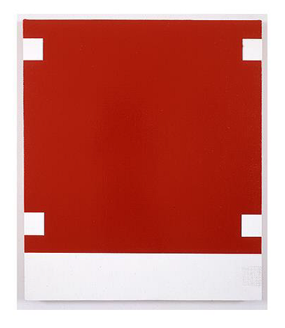
Fig.4
Alan Uglow
Palma 1988
M HKA Museum of Contemporary Art, Antwerp
© The estate of Alan Uglow
Uglow’s paintings from the late 1960s to his death in 2011 often contained a field – an expanse of clear clean paint – delineated and populated by a vocabulary of rectangles, bands or tabs of another colour. In the Hotel series, a cycle of ten equally scaled paintings on linen or canvas made between 1987 and 1989, the complexity and subtlety of these fields of colour is striking. Uglow described in 1989 how his paintings since he arrived in New York in 1969 had been focused on ‘emptying out’ and creating a painting language, learnt from Rothko and Newman, that used ‘limited means for maximum impact’.23 In Palma 1988 (fig.4), part of the Hotel series, the fields of colour are filled with meticulously applied paint. The surface of the painting is richly modulated, and through the application of skin-like layers almost sculpted to create a subtle physical depth within their surfaces. Throughout his career, Uglow always employed a variety of ways of applying paint and primers to allow for very delicate variations in colour, tone and reflectivity. In some works, he applied up to forty layers of paint, soaked into sponges to reduce the visibility of his hand. He would paint on a variety of supports – wood, metal, canvas, linen – and with a selection of brushes, rollers, and sponges, enabling him to tune each surface to maximum effect. He even took works to be sprayed by art fabricators or car body-shops, or simply left areas of works primed but unpainted.
The paintings are full of perceptual quandaries and this is key to fully understanding them. They operate phenomenologically, inviting the viewer to unpick, decipher and consider them. This quality fundamentally removes the work from being grounded in just the formal compositions of geometric shapes and colours. Palma contains four white tab-like forms that sit physically on their red field, but visually float away from it. Two further ghost-like tabs hover in the painting’s white lower band, but through their construction seem more concrete and physical. The paintings in the Hotel series each find a clarity through the physicality of the way paint is applied – its materiality – and to an attentiveness of their surfaces and edges. This extreme care in the way paint is applied counterbalances the bold visual contrasts of bright reds, whites and blacks that feature in the works. As with all Uglow’s paintings, the surfaces are paramount.
Though unspecific, each painting in the Hotel series seems to take its title from an actual Bowery hotel: Fulton, Comet, Palma, Providence, Boston, Delevan, Union, Pioneer, Palace, Prince. This titling, which is clearly not illustrative of anything within the painting, creates another dimension in which to understand the work – not through unpicking one’s perception, but through tangential connections, relationships and analogy. This stream of thought forces the viewer to marry these serene surfaces with the poetic associations that their titles might suggest – the allure or grubbiness that the hotel names might conjure up for the viewer. Through this approach, Uglow, who once stated that his paintings were ‘all about the edge’, can be seen to examine the associative conceptual boundaries outside of the work as well as the physical and perceptual boundaries they contain.24 It is a highly unusual jamming together of perception and association. Although not topographically accurate, the associative boundaries of these perceptual fields developed over Uglow’s career from the intuitive tabs and grids in the Hotel series, to framing devices and markings that seemed to echo or alluded to the painted lines on football pitches and playing fields.

Fig.5
Alan Uglow
Stadium Series #6 (Yellow) 1996
© The estate of Alan Uglow

Fig.6
Alan Uglow
C.F.C #2 (Wraparound) 1995
Galerie Onrust, Amsterdam
© The estate of Alan Uglow
For Uglow, this painted iconography of football is not truly diagrammatic. Rather it appears as an echo, or an intuitive adaptation. These visual symbols are unexpected and not always immediately apparent, housed as they are in a seemingly abstract painting. Stadium Series #6 (Yellow) 1996 (fig.5) has a pictorial unity that brings together material and perceptual characteristics of this iconography; its painted yellow lines echo both field markings and the painting’s edges and divisions.25 At times, the reference to football is indicated just through a painting’s title or colours, such as in C.F.C #2 (Wraparound) 1995 (fig.6), a small robust painting on galvanised metal which takes its name from Chelsea Football Club’s initials and its colours from the club’s strip.

Fig.7
Alan Uglow
Coaches Bench 1997–8
Museum Wiesbaden, Wiesbaden
© The estate of Alan Uglow

Fig.8
Alan Uglow
Sudkurve 1993
San Jose Art Museum, San Jose
© The estate of Alan Uglow
However, explicit references to football became more prevalent in Uglow’s work, with other icons, signs and emblems from the game almost taunting the phenomenological content of the paintings. These include a series of photographs of European stadiums in both black and white and colour, such as Untitled [Floodlight Football Stadium] 1995 (Gimpel Fils Gallery, London), which casually capture the impassioned life of these arenas. There is a visual and theoretical play between these photographs – which capture the sports field’s markings, spectatorship or the success and failure of the players – and the paintings which which they are exhibited. There are also hand-painted and lacquered sculptures – or are they object-like paintings? – resembling stadium barriers, such as Sudkurve 1993 (fig.7). When exhibited, these sculptures obstruct and break up the gallery space while complicating the unencumbered viewing of the paintings. Similarly, Uglow’s Coaches Bench 1997–8 (fig.8) with its physical size and referential nature seems at first at odds with his paintings. This life-size and pristine sculpture was based on an actual bench that Uglow saw in Texel in the Netherlands.26 The work also incorporates loudspeakers and sound recordings that refer to football in one way or another – fragments of shortwave radio music and readings of texts by the likes of Albert Camus (1913–1960), George Orwell (1903–1950) and Vladimir Nabokov (1899–1977). In its heightened aesthetic characteristic, this sculptural work can be seen to link back, connect with and maintain a dialogue with the paintings.27
For Uglow, the languages of painting and football were entwined and it was perhaps the formal and psychological drama within each that connected the two in his thinking. The abstraction from the field markings is a provocation and connects I believe to dialogues that Uglow encountered in aspects of British painting in the early 1960s. During this period the artist Bob Law displayed an equally provocative relationship to abstracting from landscape. There were also important discussions around how abstract painting could be displayed, as well as its relationship to graphic and pop art, that can be seen to align with Uglow’s own concerns.
Uglow and Bob Law
It is tempting to see a connection between the way Uglow’s later paintings – such as the works from the Stadium series – build this subliminal representation of a social and urban recreational field with how other painters from the British Isles have wrestled with landscape in non-objective and abstract art. Sean Scully, who graduated from Central three years after Uglow, has acknowledged in his photographic series Walls of Aran 2005 how his own grid-like paintings resonate in part with the form and structure of the walls bordering and enclosing the patchwork of agricultural fields (rather than sporting ones) in his beloved west of Ireland.28 Certainly, that idea of a non-objective art deriving somehow from both the look and experiences of the environment was central to the development of the St Ives modernists’ view, whose ideas were prevalent in the UK when Uglow was living and studying in the country.29 Indeed, even the non-objective white reliefs of Ben Nicholson, which in some ways appear visually similar to Uglow’s paintings, could be seen from the chalky and incised materiality of their surfaces to have been abstracted from the natural landscape. However, I see a far greater connection between Uglow’s desire to ‘empty out’ his fields and the works of the British painter Bob Law.
Law, like Uglow, has a provocative and contradictory relationship to his subject that operated conceptually and that he emphasised through material choices and juxtapositions. Law was seven years older than Uglow and also a somewhat maverick figure. He was later championed as Britain’s first minimalist – and even went on to fabricate Donald Judd’s sculptures for the US artist’s 1974 solo exhibition at the Lisson Gallery in London.30 Uglow and Law moved in similar circles in London, and both artists showed at the Grabowski Gallery, a semi-commercial and philanthropic gallery in London’s Chelsea that championed a generation of avant-garde painters.31

Fig.9
Bob Law
Landscape VIII 1959
Tate
© The estate of Bob Law

Fig.10
Bob Law
Drawing 24.4.60 1960
Tate
© The estate of Bob Law
In the late 1950s Law began a series of ‘field drawings’ – or ‘open’ and ‘closed’ drawings – that were initially inspired by lying down in the small stone walled fields on the Penwith peninsula in Cornwall. Law initially bordered the ‘emptied out’ rectangular centres of these drawings with diagrammatic trees and hedges, as in Landscape VIII 1959 (fig.9). He then simplified them until they were just lines traced around the extremities of clean paper, as in Drawing 24.4.60 1960 (fig.10). In the ‘open’ drawings, the paper is left blank and clean in the centre; in the ‘closed’ series, the centres of the drawings were filled with frenetic graphite shading, forming dark and ominous monochromatic fields.
From 1960 Law created a series of Black Paintings first exhibited that year at the ICA in London in a two-person exhibition with Peter Hobbs, following an invitation from the critic Lawrence Alloway.32 Uglow spoke frequently of the importance of London’s ICA at that time, which was under Alloway’s growing influence and that of his colleague Roger Coleman, a near neighbour to Uglow in Ladbroke Grove.33 Hobbs was also teaching at Central at the time, providing another link to Uglow. Law’s Black Paintings are densely monochromatic works built up with layers of varying pigments to create deep, light-absorbing surfaces.34

Fig.11
Bob Law in his studio in front of Mister Paranoia IV 20.11.70 (no.95) 1970 (Richard Saltoun Gallery, London)
This image was used as the invitation card for his 1971 exhibition at the Lisson Gallery, London
© The estate of Bob Law
Photo © Lisson Gallery, London
Through geography Law is associated with St Ives, having initially moved there from London in 1957. It was there that he started painting and drawing through the encouragement of artists such as Ben Nicholson and Peter Lanyon. Even during the three formative years he spent in Cornwall, however, his work can be seen as a direct challenge to the art colony’s modernist position. Law’s diagrammatic field drawings were a provocation to the more lyrical traditions prevalent in St Ives of abstracting from nature or even creating constructivist or balanced compositional non-objective artworks. It is this provocative quality that links Law with Uglow’s sensibility. Indeed, perhaps the Cornish connection goaded Law, impatient with a St Ives vocabulary that had developed through – and still at this date depended on – a respect for cubism and French painting. Law broke with this, ending the ‘open’ and ‘closed’ series with the vast Mr Paranoia sequence of laundry-marker paintings from 1969–70 (fig.11). These works have a directness that is quite unlike his more refined black monochrome works and connect with the ‘literalist tendency’ in American minimalism.35 This tendency valued the clarity in which materials could speak for themselves, unencumbered by imposed narratives or internal hierarchical compositions.
In Britain at the time, the reception of minimalism was complex, entwined as it was with other developments in North American painting and the newly found visibility of earlier twentieth century avant-gardes. In truth many things were developing concurrently. It is worth remembering that the work of the British sculptor Anthony Caro and that of his students featured heavily in the 1966 exhibition Primary Structures: Younger American and British Sculpture at the Jewish Museum in New York, yet belonged to a more formalist and Greenbergian tradition than the pragmatic materialist objectivity that can be seen now to characterise the minimalism that the exhibition announced.36 Law’s empty canvases recognise this latter position. Yet they also hold in their titles an element of almost taunting mock-confrontation.37

Fig.12
Alan Uglow’s Untitled 1968, photographed in his studio at 21 Bassett Road, Ladbroke Grove, London in 1968
© The estate of Alan Uglow
When Uglow developed his first low-panel painting Untitled 1968 (fig.12) in his Ladbroke Grove studio in 1968, he discovered a specific format and set of concerns that he would continue to engage with throughout the rest of his career – how a painting relates to its surroundings; how it can speak to and affect what is outside of its own frame. For Uglow the conceptual edge of the work expands beyond the painting itself both phenomenologically and associatively.
Untitled 1968 was the first of Uglow’s ‘lowrider’ works, which he made on a four foot by eight foot (1219 x 2438 mm) sheet of hardboard. As a standard cut unit size from the builder’s yard, it was marginally bigger than the seven foot by six foot (2134 x 1829 mm) canvas paintings that he had been making up to this point. In 1995 Uglow described the process:
The first piece was made not only as an alternative support for the canvas, but to free what was central to the canvas paintings, which were concerned with emptying out, reducing the plane to one colour, but framed by colour on top, bottom and sides. I wanted to separate those two elements, plane and frame. I took a standard 4 x 8 foot masonite panel and reinforced the back so it would float an inch [25.5 mm] from the wall, then attached four 1½ inch [38 mm] aluminium strips 9/16ths of an inch [14 mm] thick directly on the wall using double sided tape. The canvases had been vertically orientated, but the panel looked wrong as a vertical, and when I placed it horizontally it didn’t seem right floating mid-wall, so I dropped it to just off the floor. I liked that juncture where the bottom section of the frame and panel almost met the floor, that space. It became a vacuum that created tension between levitation and gravity.38
With the paint on an industrial support, the frame on the wall, the painting off the wall, and the work hovering near the floor, Uglow played with the way the viewer physically relates to the installation and navigates the tripartite surfaces of painting, wall and floor. He came to understand this work as important for the later development of his paintings. This was not just within its format but in the way he had begun an interrogation into the sculptural and architectural constraints governing the way paintings were hung – how a painting’s internal structure corresponded with its hanging and its outside environment. Uglow was to explore this dialogue through his subsequent paintings and installations in numerous ways that heighten visual and perceptive sensitivities.
Uglow referred to his low panel works in shorthand as both ‘lowriders’ and ‘pissoirs’.39 These casual descriptions reveal a lot. ‘Lowrider’ refers to the US custom-car subculture where the frame of intricately painted cars would be lowered to just inches above the road. This illustrates Uglow’s desired ‘vacuum’ and how slight and minimal changes in installation can have powerful effects. The ‘pissoir’ is a base nod to the height and porcelain-like sheen of the paintings’ surfaces, as well as referring to the artistic provocation of the artist Marcel Duchamp’s (1887–1968) infamous Fountain 1917.40
Untitled 1968 can be seen as the first of Uglow’s works to address what for the art historian Molly Warnock is ‘[a] key problem in the history of abstract painting … that of the painting’s edge, and its double and to some extent divided capacity to link the work to a larger situation and to cut it out from it’.41 She argued that these concerns would go on to govern Uglow’s subsequent painting in New York. Uglow’s integration of the conceptual edge of the painting and its interaction with what is outside of its boundaries relates to the concerns of other minimalist painters working across the Atlantic in New York at the time. Uglow’s painting can be seen to echo aspects of Frank Stella’s well-known black, aluminium and copper paintings with their ‘what you see is what you see’ literalism.42 Similarly, Jo Baer and Robert Mangold’s work at the time was formally reducing the language of painting to its most primary elements, a tendency that bears a relation to Uglow’s empty fields.43 However, Uglow’s interest in the internal space of the painting, its hanging, and the architecture outside of it perhaps resonates most closely with contemporaneous developments being worked through by Robert Ryman. It was around 1967, the year before Uglow made the first ‘lowrider’, that Ryman began valuing the way his paintings were fixed on the wall and formally integrated masking tape, staples and later various types of mounting devices into his paintings.44 For Ryman this was a symbiotic relationship between painting and the manner of presentation, a relationship that was emphasised by the fact that the paintings were made through both painterly and semi industrial processes.
The 1968 ‘lowrider’ opened up sculptural and associative readings of different surfaces and supports, concerns that would sustain Uglow throughout his career; the work also coupled these with matter-of-fact experiential or phenomenological readings. As the ‘lowrider’ series developed over the next thirty years, Uglow kept the hanging height and unit size constant, but later came to reject the wall-based frame.

Fig.13
Alan Uglow
68/88 1988
© The estate of Alan Uglow
Photo © 1988, Lorence-Monk Gallery, NYC
Uglow first revisited the ‘lowrider’ paintings in New York in 1988 when he made 68/88 (fig.13), an iteration of the earlier painting. The original had been irreparably destroyed while in storage, and he had in his studio only a photograph of it on a contact sheet.45 It was therefore in 1968, in London, when Uglow first addressed the relationship of a painting to its installation – and how that installation effects the environment in which it is hung. The painting is not just a painting on the wall. This concern, that of the relationship of the painting to its environment, was a focus for Uglow and with this re-making of the first ‘lowrider’ he acknowledged that the genesis of the idea came while he was still in England.
The work and its environment

Fig.14
Alan Uglow
Signal (Red) 1984
© The estate of Alan Uglow
In 1984 Uglow made the work Signal, which was exhibited in Cologne at the artist Gunter Umberg’s project space, Raum für Malerie.46 Signal is a diptych, a pair of paintings that relate to each other through space, both physically and mimetically. Each canvas is seven foot by six foot (2134 x 1829 mm) and consists of a pristine white field which holds within it vertical and geometric bands of different whites, as well as a single bold rectangle of colour – in one painting red (fig.14), in the other yellow. The paintings are on custom-made stretchers with the right edge deeper than the left. This means each painting’s stretched canvas plane lies at a slight angle to the flat vertical wall. They are like large, low wedges – with one edge just-slightly off the wall. Each half of Signal acts as an equivalent of the other. They are not mirror images of each other but rather include ‘small departures from the symmetry and parallelism’ that Amine Haase cited as imbuing in the viewer a heightened sense of awareness and ‘alarmed readiness’.47 If the two paintings were stacked together, they would make a unified, regular whole but when hung opposite one another, there is a psychological tension outside of the picture frame itself as this unity has been broken. This is perhaps similar to the vacuum-like force Uglow noticed in the low hanging of Untitled 1968. Both canvases, Signal (Red) and Signal (Yellow), seem to communicate – to signal – to each other across the gallery space through their shared formal characteristics and structure. This prevents them from simply appearing as refined ‘straight’ paintings. Facing one another, they are split, and though not identical, each partners the other – a pairing that asks you not to get in the way, not to disrupt their unity.
Signal is a perfect example of what Uglow and his contemporaries like Palermo were trying to develop in their work. The painter David Reed described this as ‘the New York School solution ... [to] make a painting that was a portable object that could control its environment’.48

Fig.15
Alan Uglow
Installation photographs of Signals 1987 during Century 87 at the Nieuwkerk, Amsterdam in 1987
© The estate of Alan Uglow
In 1987 Uglow made another work, Signals, which was exhibited the same year in the Nieuwkerk, a Calvinist church in Amsterdam, during the city-wide project Century 87. Signals was a series of four large monochrome panels in red, yellow (fig.15), blue and black; the four panels were installed high up on opposite and opposing walls creating a cross formation in the knave of the church. As with the two canvases that made up Signal, these four paintings spoke to each other – Uglow describes them as literally semaphoring across the space.49 Uglow was drawn to the culturally loaded space of the church when thinking about Mondrian’s abandonment of Protestantism when he became a Theosophist and joined the esoteric nineteenth century spiritual movement with which the early development of abstract art in Europe is invariably linked.50 The monochromes have a down-to-earth, concrete quality, which was enhanced by the incorporation of quadraphonic speakers playing their own parallel ‘down-to-earth’ sounds and noises into the installation. A recorded track amplified below each painting included guitars, drums, hammers, a soldier describing shooting the enemy ‘like a fish in a barrel’ and other war commentary – a collage of noise from real life and television – as well as a voice reading passages on colour and perception from the philosopher Ludwig Wittgenstein’s (1889–1951) book Remarks on Colour (1950).51 The historic formalism of Mondrian and his neoplasticism promoted an ordered and harmonious form of abstraction built from regimented and essential colours, forms and lines. This is complicated by Uglow’s installation, which uses the work’s real and associative environment(s) and is aware of the paintings’ (and installation’s) multiple contingencies.
Leaning Standards
Uglow’s experimentation with how his work was installed and affected its environment was also central to the installation of his Standard paintings, which are perhaps the works for which he is most well-known and which were gathered together at the MIT List Visual Arts Center in 2013.52 Uglow started this series of formally reduced works, of which Standard # 8 (Blue) (fig.1) is one, in the early 1990s. The paintings are a regular size, seven foot by six (2134 x 1829 mm), and each consists of a clear white canvas framed by bands of colour, simple elements that Uglow nonetheless made expansive. This white field is never uniform and contains precise overpainting and variation in its apparent emptiness. The precision and care of the painting and the subtlety of these fields gives the painted surface of these works a sculptural quality. The framing bands of colour, though flatly painted in single tones, are not uniform in their weight and physical depth – each vertical or horizontal band or tab is composed of a greater or lesser number of paint layers. This variance reveals itself through close looking but also as light levels change or the viewer moves around the painting. The width of the bands and their proportions are constant, allowing them to hold the sensitively applied sculptural flatness of the internal fields. Their simplicity is illusionistic and they are emblematic of Uglow’s complex concerns surrounding the act of painting. They are of a quality or standard, as much as they are standardised.

Fig.16
Alan Uglow
Portrait of a Standard (Blue) 2000
David Zwirner Gallery, New York
© The estate of Alan Uglow
Like the very specific installations of Signal and the ‘lowrider’ works, the Standards are installed leaning against a gallery wall.53 To reinforce the point, Uglow photographed one of these works, intended to act as a reprographic partner, ‘blue print’, or instruction showing the works' implacable placement on blocks. His use of the photographic is present in both the life-size silkscreened Portrait of a Standard (Blue) 2000 (fig.16) and in the 1994 edition 12 Standards Leaning, important not just within his own body of work but also when considering the later trajectory of painting debates from the 2010s. This is perhaps most evident when thinking of the development of ideas associated with ‘painting without painting’ and how some contemporary artists from the 2010s popularised reprographic and technological approaches to artistic authorship, making paintings and ‘networked paintings’ that activated concerns outside their frame.54 Uglow’s use of photography prefigures and relates to these debates through a form of matter-of-fact artistic detachment and how the Portraits of the Standard works can be seen to activate the Standards themselves. The portraits do this through emphasising qualities within the paintings, such as the obliqueness of angles in the propped standards, their materiality and the necessity of their particular installation and broader contingencies. Uglow’s reprographic interest has roots in the Bauhaus’s coming together of art and industry, of which László Moholy Nagy’s Telephone Paintings are a prime example.55 This discourse is likely to have been present in the Bauhaus-inspired teaching that Uglow experienced in Leicester.

Fig.17
Alan Uglow pictured leaning in the corner of Galerie Onrust, Amsterdam, 2000, between Portrait of a Standard (Blue) 2000 (left) and Standard # 8 (Blue) 1994 (right)
© The estate of Alan Uglow
It is striking that when the artist was photographed with a propped Standard and its accompanying Portrait (fig.17) he also leans with them – in one way mimicking the painting’s now sculptural quality but also emphasising what I would describe as their transient detachment. The paintings and the artist all exhibit an attitude. By being leant against the gallery walls the Standards flirt with impermanence; they seem to be without a fixed position, as if you could move them. This gives the paintings a sense of vulnerability heightened by their pristine surfaces. The paintings ask the viewer to examine them closely but also to step away. The paintings are dispassionate, exposed, but also formally tough in their execution and installation.56

Fig.18
Alan Uglow pictured lying in front of Blue Equator 2000 (Galerie Onrust, Amsterdam) at Griedervonputtkamer, Berlin, 2001
© The estate of Alan Uglow
It would be wrong to say that the way Uglow’s paintings since the 1990s have been installed within the gallery is indifferent. Rather, they have a listless pose that emphasises the body and creates a tension in the relationship between the viewer and artwork. The artworks seem to ask you to be active while they are indolent. It is a tension that animates the viewer’s own physical awareness when looking at the work. This dichotomy between our body and the painting, creating a physical connection analogous to a connection between two people seems very important for Uglow. As well as within Signal, the Standards or the Portraits, there is also an installation photograph of a lowrider painting, Blue Equator 2000 (fig.18), where the artist lies in front of the work on the gallery floor. For Uglow, something formal seems to require something casual.57
Unconventional installation
Uglow states that the ‘propping’ of his Standards came out of what he calls ‘a studio situation’.58 Indeed, his choice of small wooden wedges to lift the work just of the floor are slightly more refined examples of the wooden blocks often found in painters’ studios. Importantly, however, the manner in which these works are installed seems to be outside of the formal composition of the works themselves. Indeed, to see the geometric aspects of these paintings as clearly as possible, it may be more helpful to see them vertically. When leant, the internal and external right angles are confused by the tilt. The clear rectangular fields become just off-rectangular and parallel lines converge. In this respect, Uglow’s tilt is a willing distortion. One that is exaggerated still further in the Portraits, where the photograph of the painting is additionally taken obliquely. It connects to, but is the antithesis of, the conventional hanging of paintings by Franz Kline, for example, who Uglow greatly admired. Kline’s works were often painted sitting on the floor but when elevated on the wall seem to lose some of their connections to the physical and bodily experiences of both artist and viewer.59

Fig.19
Lee Lozano
Wave Series 1967–70, installed for the exhibition Lee Lozano: Painter at the Whitney Museum, 2 December 1970 – 3 January 1971
© Whitney Museum
Of course, there are many precedents for the stacked or leant painting. Uglow would have undoubtedly known about, and possibly seen Lee Lozano’s Wave Series 1967–70 (fig.19) when it was exhibited in 1970 at the Whitney Museum of Art.60 Here Lozano leant her eleven paintings of gestural and measured waves against black walls. The number of waves grows in each painting; each canvas was painted in one sitting, so the internal vertical crests and troughs capture the time Lozano’s brush stroke took to make. The initial painting in the series has just two waves and the tenth painting ninety-six. The last canvas was to have doubled this to include 192 waves but physically it was beyond Lozano’s capability in paint so is drawn in pencil. The particularities of Lozano’s installation and the unfinished nature of the series seem to bring her work back directly to the body and its limitations – in her case the physical movement necessary – top-to-bottom – to make each continuous brushstroke.61
However, there is an interesting London precedent which may have also helped inform Uglow’s innovation. Indeed, the London painting circle that he moved in as a student and the exhibitions which he saw may not only have informed the unconventional hanging of his work but it may also help account for the permission he gave himself to move to a clearer graphic and iconic quality in his painting. Again, we must return to the ICA, and the 1959 exhibition Place, which Uglow saw.62 The exhibition was devised by the artists Robyn Denny, Ralph Rumney and Richard Smith as a way to expand on a quality of the new American painting which they and others had seen and been discussing. As Roger Coleman, one of the exhibition’s curators, states in the catalogue:
In the works of Pollock, Rothko, Newman and Still space tends to be a direct function of the size of the painting surface and it has been called an environment. The surface is preserved as a surface and activity occurs over it vertically and horizontally expanding outwards to the four edges rather than from the edges into the center [sic].63

Fig.20
An installation photograph of Robyn Denny’s work in the exhibition Place at the Institute of Contemporary Art, London, 24 September – 24 October 1959
© Robyn Denny
Within Place, the exhibition environment itself became central. The exhibited works were paintings by the three artists involved and were made within a set of clear standard parameters of size, colour and organisation in order to create a structured maze through the galleries (fig.20). The paintings were resting on the floor, creating a warren-like environment in order to disrupt the viewer. Visitors walked through the space, confronting the works, which were arranged so that intentional visual dialogues based on repeating colours and forms could be made between what was in front of them and what was behind them. Pairings of paintings were, as with Uglow’s Signal paintings, opposite one another, requiring the viewer to turn their whole body to fully see either one. The specifics of the exhibition’s installation also questioned or interrogated the authority of the paintings themselves – they became almost decoys of paintings as much as they were paintings in their own right. The works on show hovered awkwardly between being canvases one would expect to see elevated on the gallery wall, designed for serious aesthetic contemplation, and becoming more like representations of paintings.
If one reading a visitor may have taken from Place was that the installation is inseparable from the paintings, and a painting may be a decoy as well as a painting, it was another exhibition (or series of related exhibitions) where it has been argued a proto-pop style of abstraction became highly visible in British painting.64 The 1960 exhibition Situation was held at the RBA Galleries rather than at the ICA but organised by the latter’s Deputy Director, Lawrence Alloway. The show aimed to show ‘large abstract paintings outside the status quo’.65 William Turnbull, who was a very active teacher during Uglow’s time at Central and a vocal contributor to the impassioned ICA Talks sessions which Uglow attended, was seen as an authority with respect to the British reception of European abstraction and the new North American art of the time.66 It was in this capacity that he advised Alloway on the Situation show. He had actually visited Mark Rothko and Barnett Newman in New York, having earlier spent time in Paris with Alberto Giacometti, Georges Braque and Constantin Brancusi.67 Turnbull and Alloway invited tutors and students from Central including Brian Young, John Epstein, Peter Hobbs and Peter Coviello to exhibit in Situation, and Uglow showed great interest in the exhibition.68
A lasting impact

Fig.21
Blinky Palermo
Flipper 1970
Tate
© DACS 2020
The debates around Situation provide another example of how Uglow’s experience of the art and culture he witnessed in Britain resonated in the subsequent works he was to make in New York. Situation has been characterised by the art historian Thomas Crow as a moment when a pop-enthused form of abstraction emerged in Britain, brought about by a misreading of American abstract painting as it was filtered through an equal appreciation of North American pop culture and graphic design.69 This tendency was visible in the works of Richard Smith, Bernard Cohen, Robyn Denny, Gordon House and others. Although Éric de Chassey pushed the point by calling it ‘a British specificity’, it is certainly interesting to think about the way graphic representations of actual things were found, lifted or informed abstract painting in Britain at this time.70 Perhaps this tendency is most visible in Richard Smith’s work, where designs from products like cigarette packets or the pockets of the then exotic blue jeans, were copied to inform the composition of a seemingly abstract painting or more complex painterly construction.71 Importantly, de Chassey was talking about a dialogue around composition rather than a diagrammatic approach. It is an echo or ghost of the design. In a way this tendency is similar to that used by Palermo ten years later when he used the checker pattern from a pinball machine as a source for his diptych print Flipper 1970 (fig.21). Uglow’s use of clean graphic lines in the Standards, which resemble or are lifted from the lines of sports fields, seem to belong to this same tradition which finds abstraction within a mediated cultural world of design and then subsumes it for other means.
It is a mediated cultural world that Uglow also pushed outside the frame of pure formalism. His paintings from the late 1980s to the 2000s achieved unity and clarity through embracing other art forms beside themselves – sound, photographs or an engagement with the reprographic, the facsimile and the decoy. I am acutely aware that it would be wrong to overemphasise the importance of Uglow’s experiences and the artistic circles he moved in when in Britain on his subsequent career. After all he left the capital in 1968 for a three-week trip and on his return, perhaps even before he had returned, he decided to permanently settle in New York. As Uglow dourly put it, in New York he saw ‘a situation that looked much more interesting’.72 He knew that his work was – or should be – in dialogue with the critical painting going on at that time in that city, not London. It was a culmination of a love affair with North American culture and the focused intensity of New York painting that made him feel a direct affinity to the passion of the artistic debates he found there.
In New York Uglow swiftly sought out the artistic community of painters. He frequented bars such as Max’s Kansas City, St Adrian’s, and Fanelli’s, initially becoming closely associated with the artists centred around the gallerist Klaus Kertess’s legendary Bykert Gallery where he would exhibit for the first time in 1974. He cites Paul Mogensen, Bill Bollinger, Bob Duran, David Novros, Brice Marden and Winston Roeth as all being important early contacts for him. At the time, Marden was perhaps Uglow’s greatest supporter. He purchased an early work of Uglow’s and in the mid-1970s their Bowery lofts were adjacent with a shared staircase. In 1975 Uglow turned down an ‘artist selecting artist’ solo exhibition nominated by Marden at Artists Space, as he felt unable to supply the necessary work.73 But that year he did show in the Whitney Biennale and thus in a relatively small amount of time since arriving in the city six years earlier, can be seen to have established his position. He would go on to have his work shown in the inaugural exhibitions at Mary Boone’s new gallery and then became a pivotal figure for New York painting from the early 1980s onwards. That he was able to do so reflects not only the quality of his artworks but his conviction in knowing their seriousness – a seriousness that acknowledges and gives license to developments in European – British – as well as North American art.